Business
Fonts That Work Best for Cleaning Service Flyer Designs
by Admin
-
Tuesday, July 25, 2023
471 Views
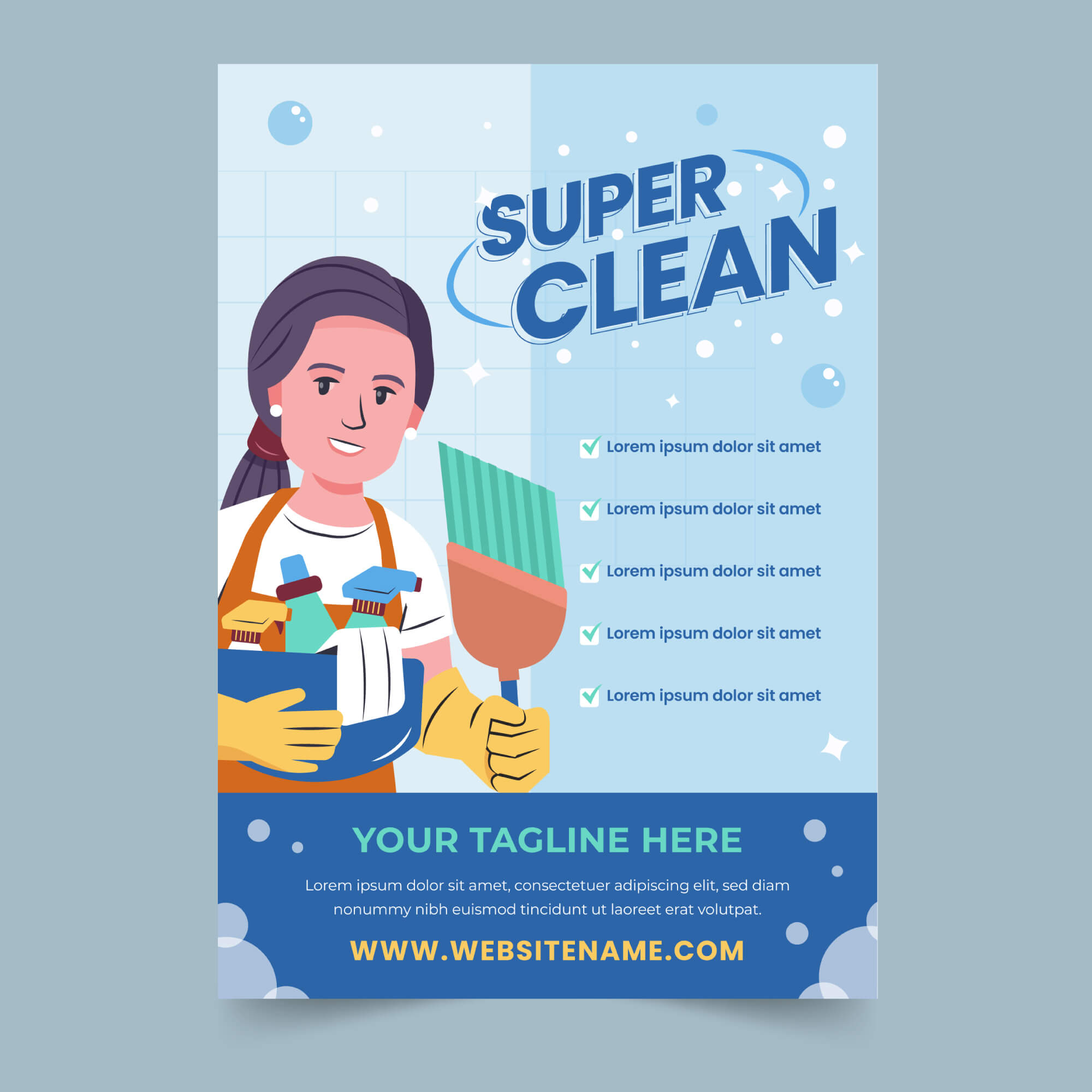
When it comes to creating a compelling cleaning service flyer, the right choice of fonts can have a significant impact on how your message is perceived. A well-designed flyer can attract potential customers and convey professionalism, trustworthiness, and attention to detail, and it is also the best cleaning service flyer idea to use in your own design. In this article, we will explore the fonts for cleaning service flyer designs, helping you create visually appealing and effective promotional materials that leave a lasting impression on your target audience.
Fonts for Cleaning Service Flyer Designs
Opt for Clean and Simple Fonts
When designing a cleaning service flyer, simplicity is key. Opt for clean and straightforward fonts that are easy to read. Sans-serif fonts like Arial, Helvetica, and Gotham are excellent choices as they provide a modern and minimalistic look while maintaining readability.
Create Hierarchy with Font Styles
To organize the information effectively, create a hierarchy of fonts with different styles. Use bold and larger fonts for headings (H1 and H2) to grab attention and convey the main message. Subheadings (H3 and H4) can be slightly smaller but still distinctive to guide readers through the content.
Incorporate Modern Script Fonts
For an added touch of elegance and warmth, consider incorporating modern script fonts in your flyer design. Script fonts can be used for highlights, important details, or taglines. However, ensure that the script font is still legible and complements the overall theme.
Avoid Overly Decorative Fonts
While decorative fonts may seem appealing, they can often be difficult to read, especially from a distance. Avoid using overly elaborate or fancy fonts that may distract from your main message, and instead, prioritize clarity and readability.
Stick to Two or Three Fonts Max
To maintain a cohesive and polished look, limit your font choices to two or three at most. Using too many fonts can create a chaotic and unprofessional appearance. Consistency is key to building brand recognition and trust.
Consider the Target Audience
Keep your target audience in mind when choosing fonts. If your cleaning service caters to a more corporate clientele, go for sleek and professional fonts. On the other hand, if your services are aimed at a more laid-back and creative audience, you can experiment with fonts that have a bit more personality.
Use Fonts that Reflect Your Brand Identity
Fonts play a vital role in shaping your brand’s identity. If your cleaning service has a specific branding style, ensure that the chosen fonts align with that image. Consistency across all marketing materials helps reinforce your brand’s message and build trust with customers.
Test for Readability
Before finalizing your flyer design, test it for readability. Print out a sample and check if the fonts are easy to read both up close and from a distance. Make any necessary adjustments to improve legibility.
Utilize White Space
Don’t overcrowd your flyer with text. Leave enough white space to allow the content to breathe, making it visually appealing and less overwhelming. White space can also help emphasize the importance of certain elements on the flyer.
Ensure Compatibility
Consider the practical aspect of font usage. Ensure that the chosen fonts are compatible across different platforms and devices, from print to digital media.
Align Fonts with Colors and Images
For a harmonious flyer design, align the chosen fonts with your color scheme and images. The fonts should complement the visuals and create a unified and attractive look.
Use Bullet Points and Lists
To present information in a clear and concise manner, use bullet points and lists. These formatting elements make it easier for readers to grasp key points quickly.
Add a Call-to-Action (CTA)
Don’t forget to include a compelling call-to-action that encourages readers to take action. A well-designed CTA combined with the right font choice can significantly increase response rates.
Conclusion
In conclusion, selecting the right fonts for your cleaning service flyer designs can make a world of difference in how your message is conveyed and received. Stick to clean and simple fonts, create a hierarchy, and consider your target audience and brand identity. By following these tips and using fonts that complement your overall design, you can create eye-catching flyers that effectively promote your cleaning services and attract more customers.


